
Better UX improves conversion by making value easier to understand, reducing friction and helping visitors reach the right decision with less effort.
Every screen should answer the next question.
Visitors move through a sequence: what is this, is it relevant, can I trust it and what should I do next. Strong UX makes these answers visible in the right order.
When information hierarchy is weak, users work harder and conversion drops.
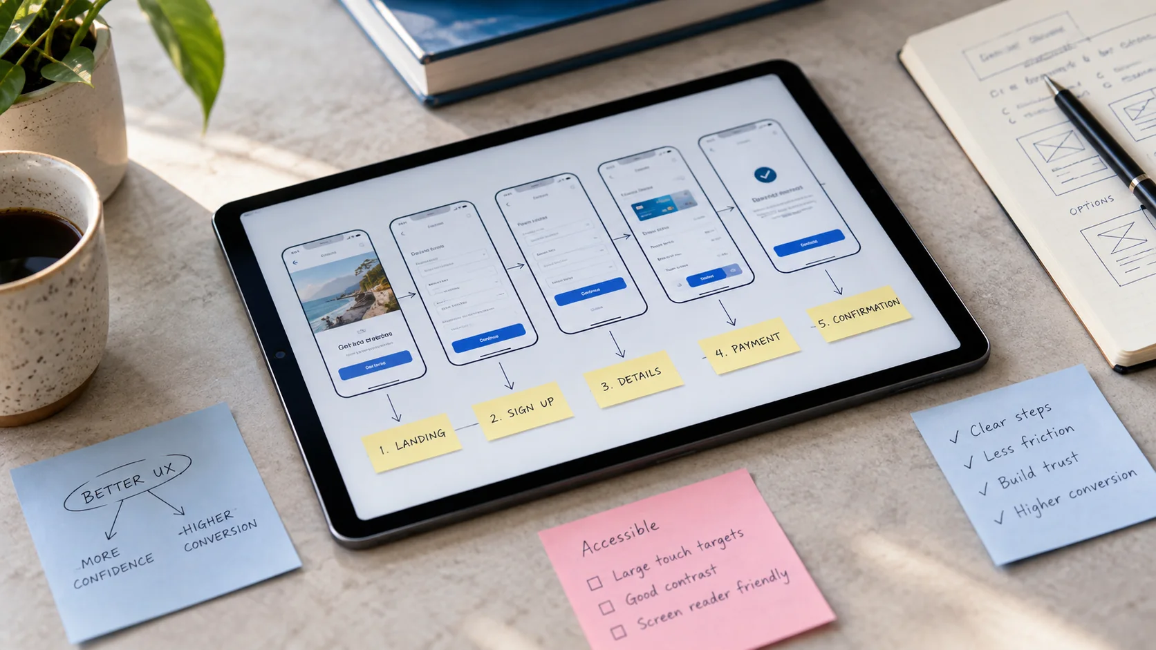
Mobile experience is part of credibility.
Many decision-makers first encounter a service business on a phone. Tight spacing, readable type, reliable navigation and clear touch targets directly affect perception.
Responsive design should be intentionally composed, not simply compressed from desktop.

Measure friction, not only traffic.
Analytics, form completion, scroll depth and click behavior reveal where visitors hesitate or abandon the journey.
Small improvements to clarity and interaction can compound into stronger lead quality over time.
Make the next decision visible on every page
For a service business, conversion often begins with understanding. Visitors need to know whether the company can help, what the service includes and how a conversation starts. Use a clear page hierarchy that answers those questions in a sensible order. A headline should establish relevance before a visitor is asked to navigate a complex service taxonomy.
Give each page a primary next step and explain what happens after it. A consultation button is more useful when customers know whether they will book a call or send a brief. Keep secondary actions available for people who need more evidence, such as viewing a related project. Clear choices help visitors move forward without feeling pushed.
Reduce friction in mobile reading and interaction
Test the journey with a real phone-sized viewport, including long titles, forms and open navigation states. Check that headings wrap naturally, images stay inside their frames and important controls remain reachable. Horizontal scrolling should be deliberate and understandable, rather than an accidental consequence of a fixed-width component.
Design interactions with useful feedback. A selected tab should be clearly marked, a form error should explain the correction and a loading state should show that an action is underway. Respect reduced-motion preferences and make controls usable by keyboard where appropriate. Good interaction design gives customers confidence that the website has understood their action.
Use evidence where customers hesitate
Place relevant case studies, process explanations and frequently asked questions close to the decision they support. A visitor comparing services may need an example of scope, while someone preparing an enquiry may need information about the first meeting. Evidence works best when it answers a specific concern rather than appearing as decorative proof far from the action.
Review the content with the sales team to identify common misunderstandings. If visitors repeatedly ask whether a service includes production or implementation, explain that boundary on the service page. If the business serves several audiences, help visitors recognize the route relevant to them. Better UX often comes from improving information architecture, not simply adding visual effects.
Measure conversion quality and learn from behavior
Agree on what counts as a meaningful conversion, such as an enquiry with enough information to begin a useful discussion. Track the steps leading to that outcome and check that measurement works on mobile. A rise in button clicks is less valuable if customers abandon the form or submit requests outside the company’s scope.
Combine analytics with observation and feedback. Watch representative users attempt an important task, ask what feels unclear and compare those findings with enquiry data. Improve one significant source of friction at a time, then review the result. UX becomes a continuous business practice when the team uses evidence to make the experience clearer, more accessible and easier to act on.